Tuesday, 28 May 2013
Final Zine
Above are the images of the final stage of my zine for the Sheffield Castle Market which I have chosen to portray using photography. I am really pleased with my final outcome and feel that it explores the Sheffield Castle Market fondly mainly focusing on the indoor stalls. I have enjoyed this second half of my Skills Workshop Project and have learned a great deal about getting into the project and been creative, taking risk to discover new mediums of designing. I feel that I have provided a good grid format throughout my zine and that it shows good presentation.
Different Coloured Front Covers
Here I have taken my design layout from paper and used the colour palettes from my previous post and developed the layout using the colours. On some of the concepts I have used the exact colour palette to produce an outcome and on others I have used them as inspirations. As you can see I really like the idea of using the colour Yellow. Not too bright but not too dark to keep it clean and not blinding or dull to the viewer. I played around with some colours that would go with the Yellow background and the last image is my favourite choice of layout. I think that the colours are quite warm and inviting and compliment each other quite well.
Colour Palettes
Here I have taken screen shots of different colour schemes that I think would suit my front cover. Although my design layout should only consist of the use of three colours, I will look at each colour palette and decide on which colour would be suited for the front cover of my Zine for the Sheffield Castle Market.
Monday, 27 May 2013
Book Binding
I have found a helpful video on YouTube that shows a tutorial on how to hand bind books. I know i'll be using this video to help me with binding my zine.
Chosen Front Cover Design
This is the chosen design idea for the front cover for my Zine. I have chosen this design because I feel that the simple design layout will suit the Zine as complete final outcome. As I have imagined my head for my front cover to be simple with a great use of complimentary colours, this is the design that I feel fits perfectly with the description I have in my head. I am really excited to see the final outcome that I will produce using the Adobe Creative Suite.
Front Cover Ideas
For the front cover of my Zine I have drawn up some concept designs which I think will look appealing on the front cover. I have included parts of the castle market on some of them such as the outline of the building of the market, Cafe table clothes and also one of the diners. I have also included my own interpretation on them too.
All of the idea's that I have drawn are all really good designs in which I feel that they can all be a good choice for the front cover. I will have to take each design and design which design I would like to use for my final outcome.
Chosen Zine Style
This is the chosen type of zine that I am going to create for my final outcome as it is quite simple and easy to follow through by turning each page. I feel that I will be able to portray the images of the Castle Market better this way and show a wider range of views of the market instead of just the one which I think will be better.
Zine Style Ideas
From the research that I have gathered for some inspiration for my zine I have chosen three options in which I can produce my zine. All three are of of which simple designs so then I am not over complication my design process to reach my final outcome. From my previous Zine outcome which was a Constantina of a panorama of a part of the castle market, I have learned that my final outcome needs to have a more professional approach to it and also include a grid system in order to keep the professional look. Here is the design layouts I have drawn up for my Zine of the Sheffield Castle Market.
Zine Research
To get in the frame of mind of creating my own zine of the Sheffield
Castle Market I have done some research into other existing zines to get
some inspiration in the design process. Here are the images of the
zines that I preferred the most that I found using Google.
Final Packaging
These are the pictures of my packaging in it's final stages of production. The images that I have taken of my final packaging are the same positions as my prototype packaging to show that the measurements of the packaging from the prototype to the final outcome worked out. I am really pleased with the final outcome and how it has turned out how I imagined it. I feel that I have done a good job with my packaging and I am ready to continue with my second given task of my Zine.
Saturday, 25 May 2013
Packaging Net Final Complete With Inside Design
Here is my final net layout of my packaging which is complete with the inside design of my three elements as a designer; Technology, Music and Illustration. On the outside of my packaging I have only included my logo design which will be presented along the top of the package when it is put together. My logo is at the moment presented upside down which is of course on purpose as when the packaging is fully built the logo will be the right way round which will indicate the opening of the box.
I am really happy with my outcome of the packaging and feel that I have developed from my previous packaging to a better standard of design. I will be uploading images of my packaging in it's final stage once printed out onto good stock paper and capture the process of building it.
Orbit Final
This is the final stage of the orbit design that will be presented inside of my final packaging. I am quite pleased with the outcome of the designs and the colour scheme that I have chosen to design with. I think that the colours are well presented and compliment the designs within them. As I have chosen a simple black background I think that this also adds to the complimentary factor of the designs.
With the structure of my packaging, I can already tell that the final design of my orbit elements will be well presented when my packaging is opened and flat which how I designed it to work.
I am really excited to see the design in action with my packaging and to see the packaging as a final outcome.
Final Silhouette
This is the final stage of my silhouette of my portrait. I have kept within the simple theme of design layout to not differ from my other designs. Because I have designed the silhouette with the same style as my others, I feel that the whole design as a final will look visually accomplished.
I am quite pleased with the final outcome of the design and I can't wait to see what the final design is going to look like when I have put it together. I trust that the colour scheme that I have chosen for my packaging will all work together for each element of me as a designer.
I will now be in the process of fitting all of my designs together to produce a final image to be presented within my packaging.
Development of Silhouette
To develop my silhouette of my portrait I have drawn out a few styles of silhouettes that would look good as a design inside of my packaging. As I have chosen to continue with the idea of a crack in the head as my main design of silhouette I produced and developed this further and explored into different styles where I could portray the crack on the head. The reason for the crack in the head of my silhouette portrait is to represent that the elements of what make me a designer which are; Technology, Music and Illustration, to have fallen out of my head and now orbit around the silhouette. After experimenting with different styles and deciding on the best outcome for my final design, I have remained with original idea of a simple crack which I think will keep with the theme of my other designs that represent the elements of me as a designer.
I will be developing the silhouette of myself further in Adobe Illustrator and continue with the production of my final packaging.
Developed Illustration Designs
Friday, 24 May 2013
Developed Music Designs
Here are my new developed designs for the music aspect of me as a designer. the designs are of a CD, Earphone, Speaker and also a music note. I chose these designs for my finals because I felt that they all relate directly to music which is what my intentions were and I feel that I have been successful in doing so. These designs will be presented in my final packaging along with my other final designs as a whole piece.
Developed Technology Designs
Here are the Designs that I have produced using Adobe Illustrator. Although the green looks really vibrant on display, the shade of green that I used was a subtle shade as to not strain the viewers sight.
The designs are of a memory stick, light bulb, gear and the symbol for the web. I am quite pleased with the outcome of the final designs and how well the vector images are brought out by using simple colours. I feel that this process of designing my aspects as a designer are truly proving to work and also that they will look well presented in the final outcome of my packaging.
Packaging Prototypes
Above is the first version of my packaging. It is a simple box which I feel is a good choice to go with and will be able to portray visual elements perfectly. But whilst developing my design ideas this design for my packaging needs tweaking and developing to produce a great final piece.
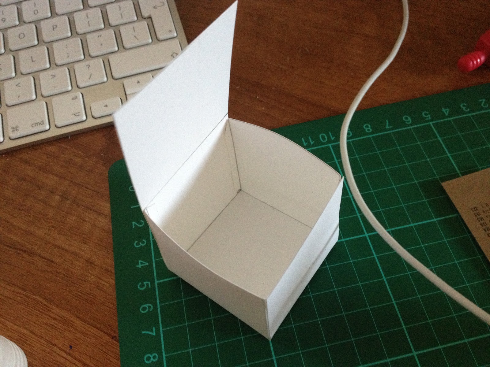
Here are two pictures of an open net of my box packaging. To fit my design on the inside of the packaging perfectly enough to perfectly lay the design out, I have expanded the net by adding extra grids making the box wide enough to fit my designs on.
When making the box I then realised that once it was put together it would not stay in the up right position. I then developed the net layout with tabs that would tuck into the sides of the box which would keep the box together. After making the tabs I then realised that they would need to be longer in order be sure that they would be sturdy.
After tweaking the let layout to my packaging and longer tabs in order to keep the box together, above are images of my packaging prototype in the stages from been flat to then been put together to show where the tabs go and the box in it's final position.
I am quite happy with the final outcome of the prototype and glad that it has all worked out in the end. I can not wait to start with my designs and see the final outcome in at the end.
Colour Schemes
To make my packaging complete and immaculate I want to have a good combination of colours that will compliment the packaging itself and make it visually attractive.
I have been on the website named colour lovers who provide a great range of colour schemes that all compliment each other. I have have found some colour schemes from this website which I will consider to use for the final production of my final package.
Here are the colour schemes that I liked.
I particularly like the fifth colour scheme down as in visioned in my head these are the type of colours that I would like to use for the inside design of my packaging and outside also.
Subscribe to:
Posts (Atom)